The new Audi rings
Audi customers value the progressive design and attention to detail in the premium brand’s products. That’s reflected in the changes to the rings on Audi vehicles. André Georgi, a designer at Audi who oversaw the redesign of the rings, says: “Strong brands win over customers primarily through their products’ underlying substance and discreet identifying elements. At Audi, this has always been the case, and we’re now making it even more consistent. Our philosophy is that every detail must convey a meaning or serve a purpose.”
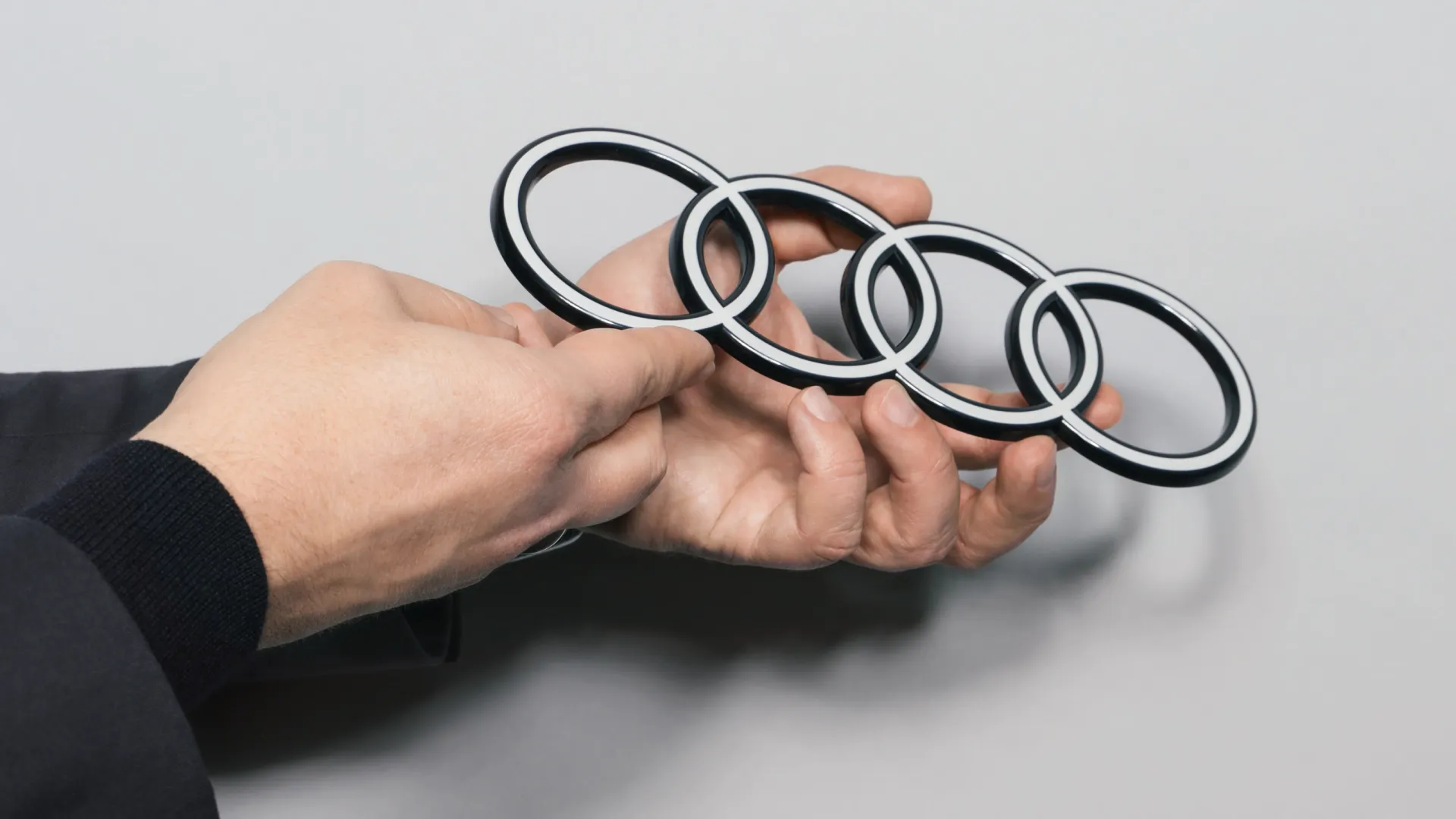
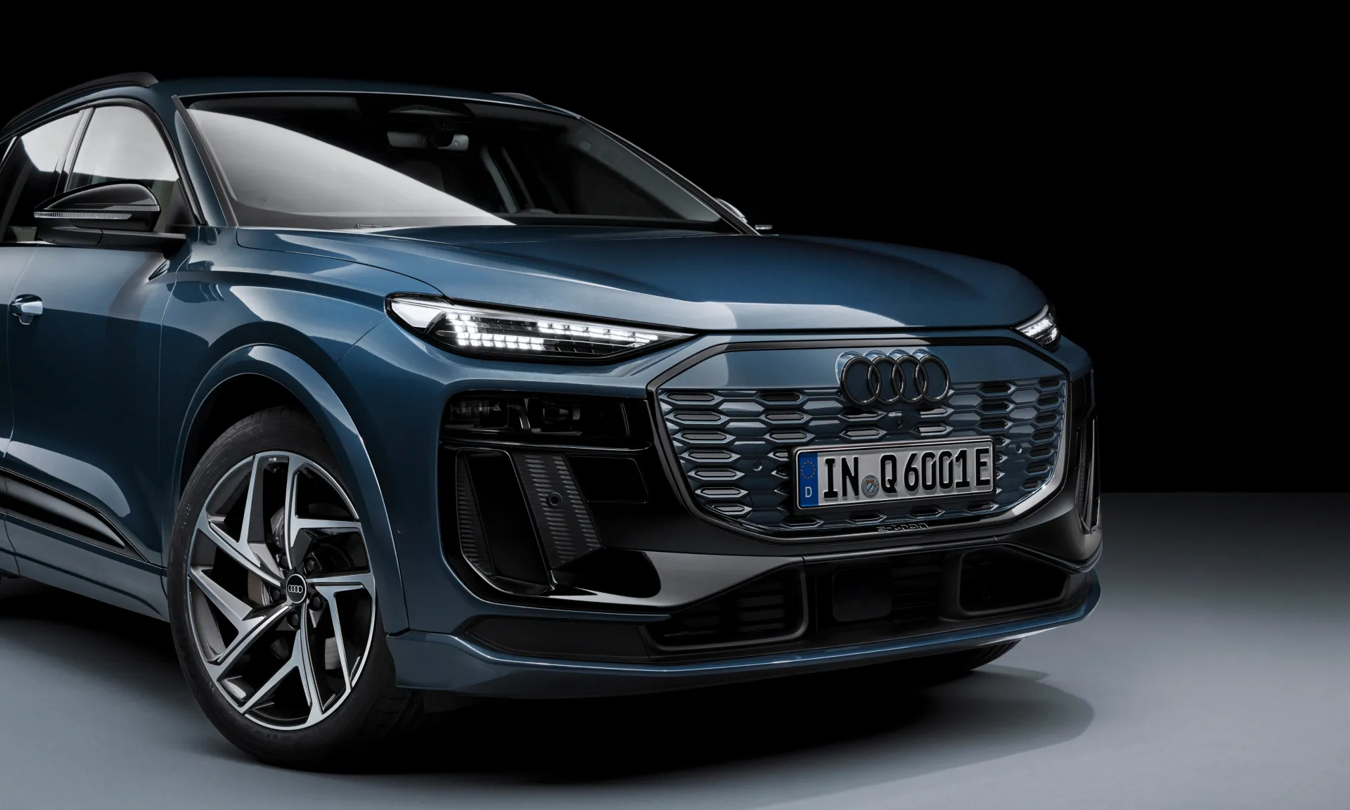
On vehicles, it is above all the four Audi rings, unmissable on the front and rear of every Audi model, that immediately signal the product brand. These Audi rings are now 2D rather than 3D. As Georgi explains, “That gives our rings a significantly more modern and even more graphic makeover, although their geometry is almost identical to the former ones.”
“The two-dimensionality gives our rings a significantly more modern and even more graphic makeover.”
-

André Georgi has been a designer at Audi for over 20 years. He initially worked in the Exterior Design department, where he was responsible for headlights and rear lights. Since 2017, his main focus has been on interior and interface design. He oversaw the redesign of the rings.
-

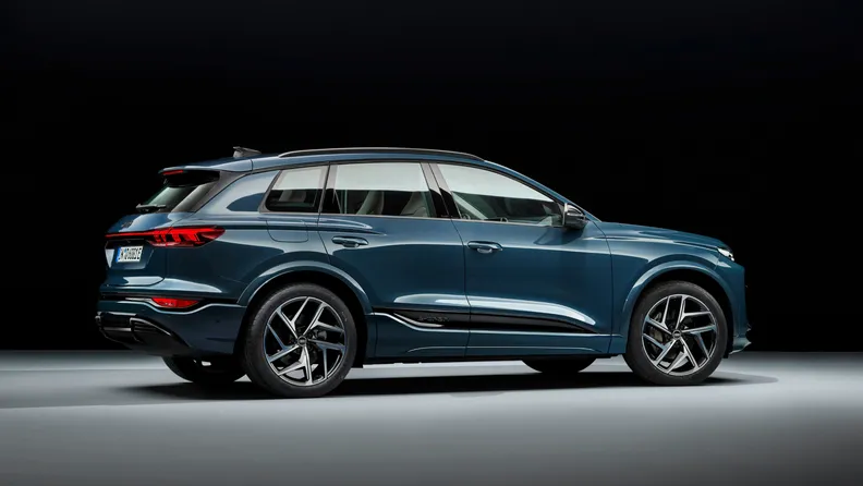
The four rings on the rear make an Audi an Audi. The vehicle’s design speaks for itself. The new two-dimensional look of the rings brings them up to date: they now look far more modern and even more graphic.
But the 2D update isn’t a response to short-lived trends. Two-dimensional rings originated at Audi in 2016 as a consequence of digitalisation. Frederik Kalisch, brand strategist at Audi, explains: “We always want to depict the rings in a manner that suits the medium. Three-dimensionality on two-dimensional displays would not have met our technical and aesthetic requirements. So we opted against a 3D look for the rings in the digital world. To ensure a consistent brand presence across all customer touchpoints, we coordinated with the design team to kick off the process of redesigning the rings on our vehicles.”
One advantage of the highly graphic brand logo is that it looks great in two dimensions. So the designers dedicated themselves to moving the corporate identity from the digital world and onto Audi vehicles. The idea is that the four rings should look the same everywhere in the future: whether in a magazine, on your smartphone, on a billboard or on your car.
“To ensure a consistent brand presence, the rings on the vehicle have been redesigned.”
The design hallmarks of the new 2D Audi rings are as follows: The rings are chrome-free with a black-and-white look. The striking white floats are embedded in a black glass body for an even greater radiance. The thin black border around the rings makes for a consistent, premium-quality appearance, regardless of the car’s paint or radiator grille colour. Customers can continue to opt for the new Audi rings in black. This variation replaces the white with a dark grey that looks like high-gloss black.
-

Frederik Kalisch studied industrial design, and later specialised in design strategy. Apart from a brief break, he has been working at Audi as a brand strategist since 2011.
-

The detailed model, derivative and technology identifier is now laser-engraved on the B-pillar, so that it is always in passengers’ field of view when getting into and out of the vehicle. In the future, only Audi’s unique font, known as “Audi Type”, will be used here and elsewhere in the vehicle.
In addition to the new version of the four rings, Audi’s vehicle identification has been standardised across all models. The model, derivative and technology identifier can now be found on the B-pillar, which has an identical design on all vehicles: always two parts in high-gloss black. Moreover, the model identifier on the B-pillar is always in passengers’ field of vision when getting into and out of the vehicle. Georgi explains: “The lettering on the B-pillar was deliberately engraved tone-on-tone. The basic tone is significantly more restrained without compromising on distinctiveness or quality. It’s not only that vehicle identification has become more premium; we have also standardised the fonts in and on the vehicle. In the future, our models will only use Audi’s unique font, known as ‘Audi Type’. Identification and vehicle design now act as a unit that aligns with Audi’s new brand positioning.”